Last semester I proposed a few idea based around youth unemployment in Europe. I came up with two ideas, one based around giving young people the information they need to find a job, and the other was to help young people better manage their finances.
The problem with this was that came up with these ideas first and then did research around the topic to support my ideas. This resulted in my ideas not being as fully fleshed out as they could be. I still think they are good ideas, I just think they need more development before they can be reconsidered.
With that in mind, I will be following the same topic I chose last year, this being the European Youth Award category “Money Matters”, and look deeper into this topic. I am researching youth unemployment in Europe, what may be causing it, and what effects it is having on each individual country and Europe as a whole. The majority of my research will be going on to my Padlet, but I will be summarising the findings of this research here.
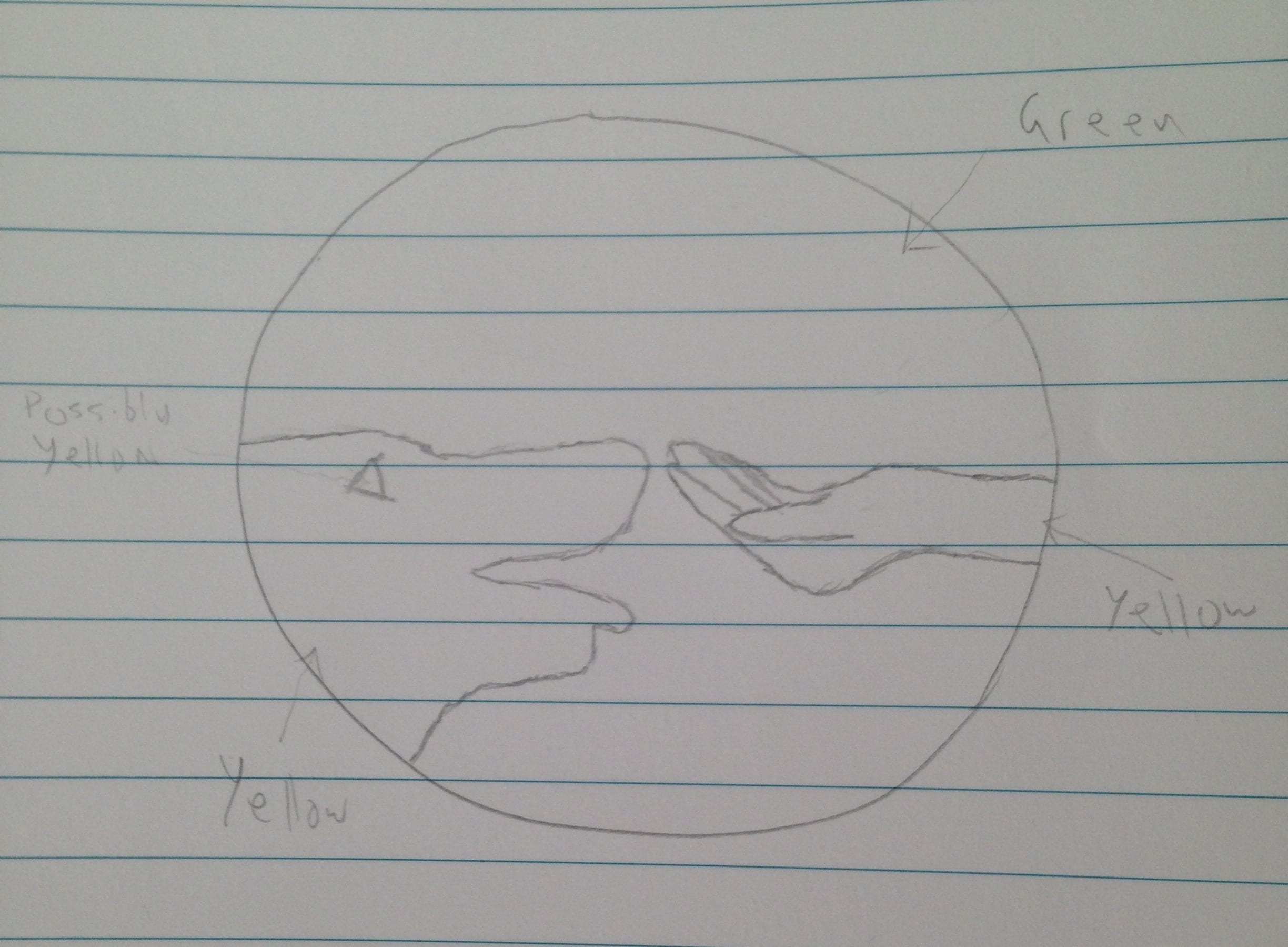
Last week we we’re given a brief to create a logo for a company. They specialise in training dogs to be better behaved and wanted the logo to reflect this. I started by sketching an idea I had.
The thought process behind this design is it shows a hand reaching out to a dog, palm upwards, to show that they trust and care for the dog. They could be giving them a treat, rewarding good behaviour. Simply having your hand that close to a dogs mouth (and in effect, teeth) shows that the human trusts the dog.
In the workshop we took our drawn ideas and created them in Adobe Illustrator.
I chose the colours green and yellow as they are quite passive and friendly colours and that reflects the theme I am going for with this logo. The name for the company is really just to fill space and show where the name would be. I don’t think the name that is there now is fully appropriate but it does still show the message I want to give off with this logo.
When people are looking for a service or company to use or work with, a good first impression is crucial. One way of immediately presenting yourself is through a logo. A good logo should give you audience an good impression of what your company stands for and what is expected of them.
An example of an effective logo is the steam logo.
Steam is an online retailer for video games and software packages. It sells from a large catalogue of software, and as such you would want everything on the site to be running smoothly. You could imagine the mechanics presented on the logo turning smoothly and gives an accurate representation of what can be expected from the company.
An example a bad logo is this one for Highlight.
While it does represent it’s name quit well, it is very uncomfortable for the user to look at as it seems blurry and makes you feel like something is wrong with either your monitor or your eyes.
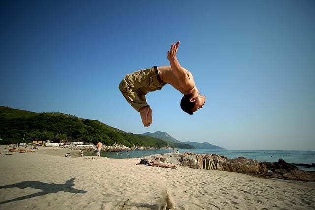
This week we learned about adding images and creating shapes in Photoshop and After Effects, and animating them using keyframes. We started by finding an image of a kitten and then finding something for them to look at.
The image I went for was a man doing a backflip, and my plan was to make this guy do a backflip over the cat as it watches in awe. We started by cutting the images out, isolating them from their backgrounds. This was mainly done with the pen tool as it provides a lot of accuracy since the user decides where each point is added. It can take longer than some other tools but the cleanness that you can achieve is worth it.
To animate these images I imported them into after effects and key-framed in their movements. This included the dude rotating over a period of time, and following a curved path across the screen. The cat follows the dude with it’s head and the body (which the head is attached to) turns and moves slightly, making it look like it is rolling.
While my final project probably won’t be… quite like this, it gives a lot of ideas for things that I can do with this software.
Instead of manually selecting points for After Effects to track, 3D tracking involves the software scanning a al of a video clip for points to track, and then compiles all the data together for easier use by the user. The first video included the same box as the first 2D tracking video, but this time the camera was moving and the camera was still.
Since After Effects had detected where the surface of the box was in a 3D space, I simply added the text on top of it. I also gave them a shadow by adding a light and telling it where to cast the shadow. It was simple to add text to a flat surface as After Effects can work out by analysing the whole clip where each surface is in space. It simple needs points that it can recognise and can track the movement of. The dots in the box, and even the corners of the box itself, are perfect for this.
I also added a black rectangle over a magazine on the right. Adding it was just as simple as adding the text, but what’s really impressive about this is that since it is adding it into a 3D space by working out how the camera is moving, it can continue to move accurately even when when the magazine is out of shot. This is different to 2D tracking, because if one of the points I manually selected for tracking went out of frame After Effects could even begin to guess where it is now, and so just stops tracking that area. With 3D tracking, there are many other point for it to look out for so it can work out where that area is, even when the surface i’ve added something to is no longer visible.
Next we had a video of a road, with the camera moving around, and we were giving an image of a hole. After Effects was able to track where the ground was, and I then laid the hole on that surface. I wanted to give the hole depth, and to do that I would need to simulate a parallax effect. To do this, I duplicated the layer with the hole on it, placed it above the original and masked out the actual hole, leaving only the cracked edges. I also mad the bottom layer of the hole bigger, so you couldn’t see the edge again inside the hole. Lastly, I made it so that everything that could be seen of the bottom hole layer that was outside the top hole (so not including the actual hole) would be masked out. This was to hide the edges of the bottom layer so you would only see the edges of the top layer. I then just added a grungy texture and did some colour correction to make it all blend in better.
It was surprisingly simple to add something like this to a layer, and I’ll definitely have to look into using it further for my final project. I already have a few ideas to use After Effect’s tracking capabilities but I want to try the other some things in the other workshops before I finalise anything.