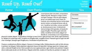
I started to play around with a few ideas for how my website may look on Photoshop. I put together a few elements, some images and some text to see how it looked. I already had an idea in my mind, so I just wanted to see how it looked in reality.
This is pretty much what I expect the main page to look like (It only looks this blurry on the blog, it’s much crisper on my computer). The text will be an introduction to the website and any recent news about the website that they should know about. There will also be the box to login available on every page.
The image on the left is a stock photo I found of some people jumping in a field. I just cut them out in photoshop, silhouetted them and added an oval in a colour that fits the theme of the page. I think it fits really well along with the text and balances out the weight from the login box, adding a space to each side of the page.
