Job hunting websites research

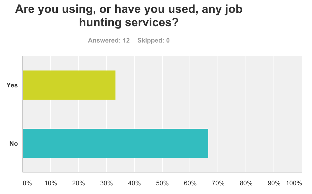
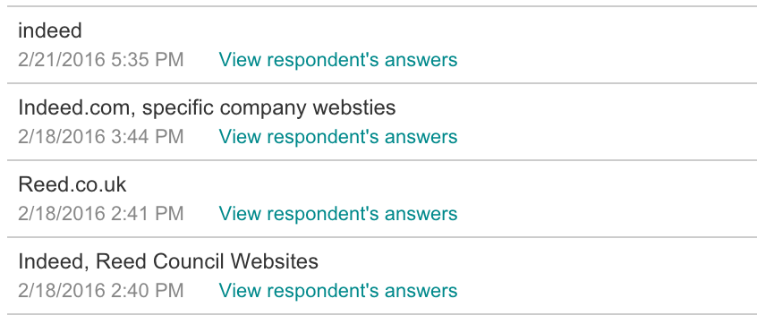
In order to make my website more appealing to my target audience, I needed to know what job hunting websites, if any, that they were using. Thanks to the results from my survey I knew which websites my demographic found the most appealing and we’re using more frequently. These were revealed to be Indeed and Reed, so I checked them out.

Screen Shot 2016-03-02 at 10.00.10


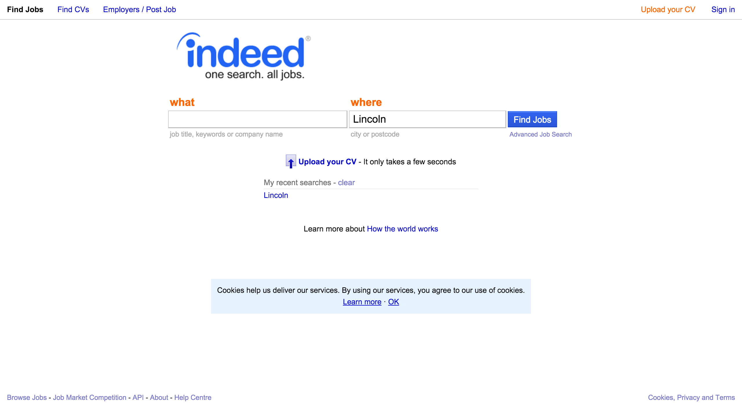
Upon entering the website you are greeted with two text boxes, asking for “what” kind of work you’d like to do, and “where” you would be willing to do it. While I think this may be a little intimidating, being the first thing that you see, I may want to consider adding something like this to my service. Users will more than likely wish to include preferred fields of work, and where they are located so they are not offered something too far away from them. Colour wise, the main theme for this website seems to be blue and orange. These colour contrast one another so they work well together, but I don’t think they work very well together in this instance. It feels like there is a main theme with the blue all over the page, with just a few light splashes of orange here and there. I am considering using blue as a primary colour in my design, but I think I may contrast it with a different shade of blue. I think this will also fit the theme of my idea too, what with the idea of dream jobs and “blue-sky thinking”.

To find out a little more I entered a keyword into the “what” box and search for some results. I went with “Law” because I thought it would return a good number of results.

Screen Shot 2016-03-02 at 10.03.49


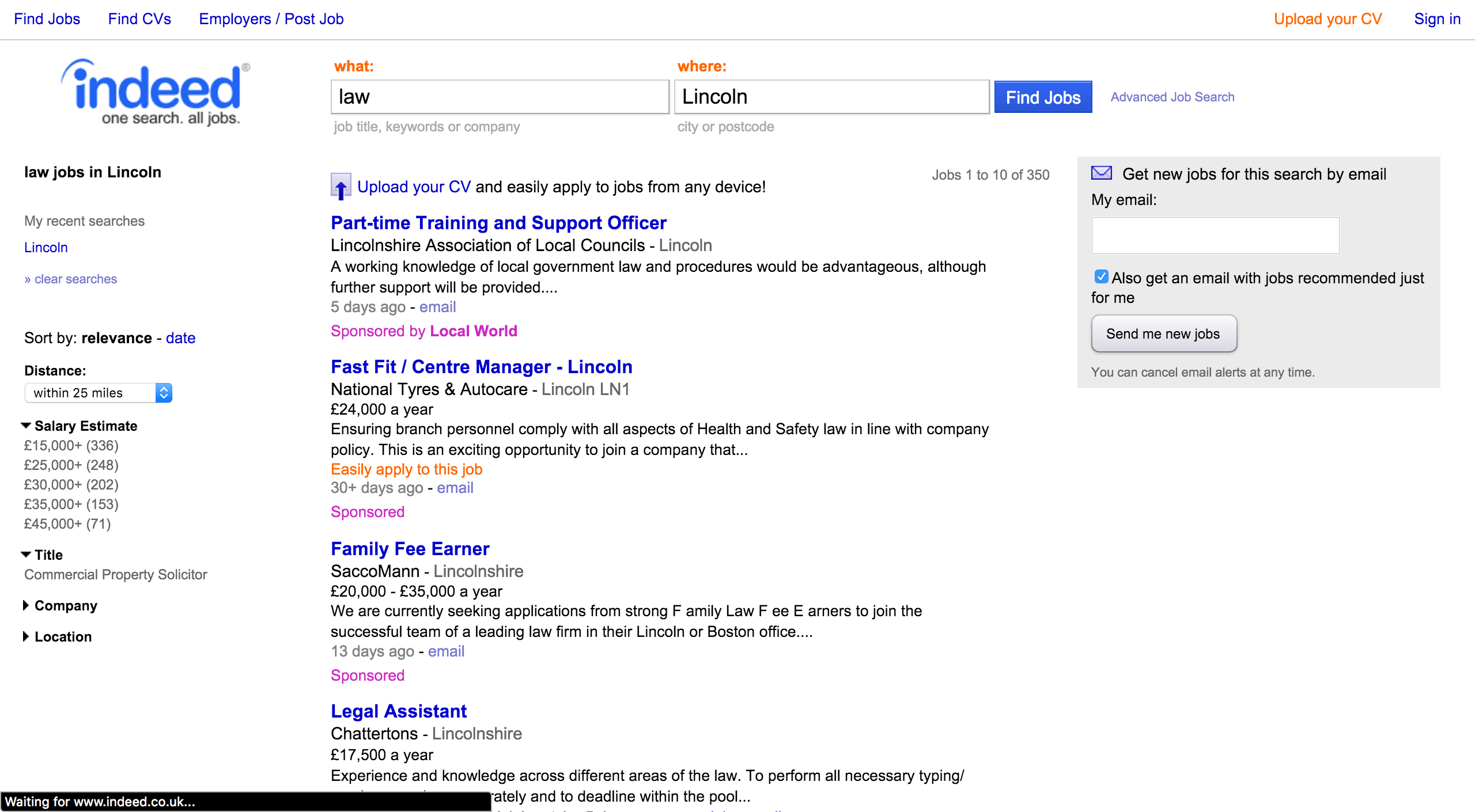
Here I was presented with a list of offers relating to the “what” and “where” I previously gave. The listings are organised neatly, each option is clearly separated from the rest. On the side you can refine your search by increasing or decreasing the distance away from you, and the average salary. All these aspects are important to consider so it is good to be able to search with them in mind. Looking at the colour scheme again I still don’t think the clashing colour works, especially now that they’ve thrown pink into the mix. Personally I think this would look a lot cleaner just using different shades of blue, and that’s what I’ll be doing.

The other website that was popular on my survey was Reed.

Screen Shot 2016-03-02 at 11.42.59


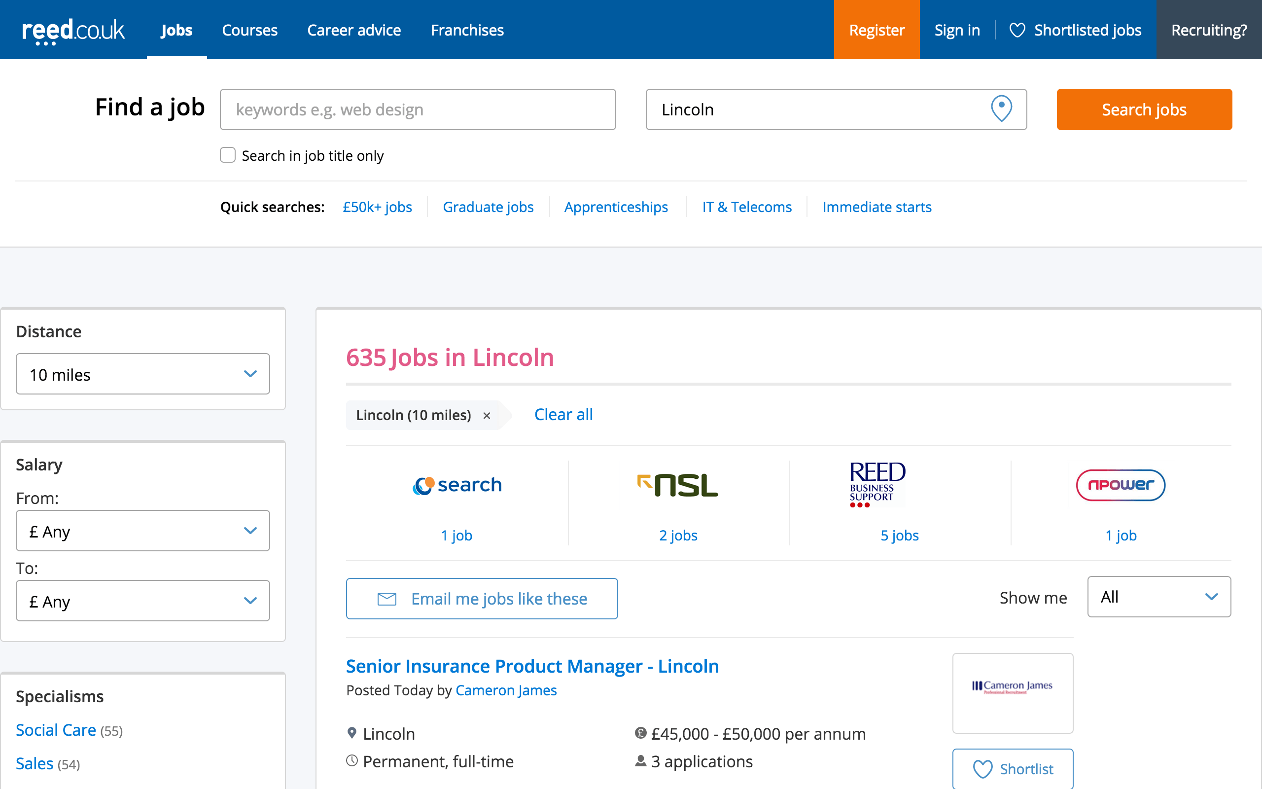
Visually, Reed does a lot of things similar to Indeed. They both use a blue and orange colour scheme with some splashes of pink here and there. I don’t know what is so appealing about the combination of these colours, but whatever it is I don’t really understand it. However I do think it works a little better here,with orange being used for buttons rather than text links. Still not sure about the use of pink though. Also, I think they way in which you can refine your search is much better on Reed. You can still refine by adjusting the distance from you and salary, and you can also specify the field of work, type of job (contract, temporary etc.), who the job ad was posted by and when it was posted. This wide range of options can really help users pin down a job posting ideal for them.

While I won’t be using a lot of the job hunting features, checking out Reed and Indeed has given me some ideas of how to lay out my website.

Reach Up Survey 2

I also asked the people who took part in my survey whether or not they have used or are currently using and job hunting services.

Screen Shot 2016-02-21 at 17.44.03


While the results were not as positive as I had hoped they would be, what  got still gives me some room to work from. I can see that job hunting websites are still being used, although maybe they aren’t as popular with my target demographic. To find out more I asked what services the people who answered positively used.

Screen Shot 2016-03-02 at 09.42.40


The two most popular results were Indeed, with 3 mentions, and Reed, with 2 mentions. To see what makes these two so popular I’m going to check out there websites and see what how they perform the service they offer. I will also being looking at how they present the information they offer and how they have design their website to look.

Reach Up Survey

To see how my audience feels about the product I want to produce, I created a survey with Survey Monkey. I asked questions to find out more about the background of the person answering the survey, involving their work history and the experiences in getting a job. I also asked what kind of features people would like to see from my service.

Screen Shot 2016-02-21 at 18.16.40 Screen Shot 2016-02-21 at 17.43.32

I first asked people whether or not they are currently employed and if they are in a career path they wish to pursue. Most of the people who answered are unemployed and only one person out of the people who had a job wanted to continue that line of work. The results of this survey present multiple issues that I hope I’d be able to help with my service. Getting people into a job is one thing, but helping people find a career that makes them happy and want to continue pursing can be another thing entirely. This is what I want to be able to help people with with Reach Up, so that they are not just working, but are happy to be doing so.

Screen Shot 2016-02-21 at 17.44.15

I asked if people would be interested in a service that helps them get a job more closely related to their interests. The results were overwhelmingly positive as everyone who took the survey said that they would. This shows that there is definitely an audience for this product, and many people who would use it.

I wanted to know what kind of features people would want to see from this service, so I asked about a few and left a space for people to add their own ideas below.

Screen Shot 2016-02-21 at 17.44.28

The most popular of the three, with 100% of people who did the survey interested in it, was getting advice from people in the career you are interested in. This is great since my original plan for this service was just this; connecting young people with other people in the industry they were looking to get into. The next most popular result was to hear advice from other users, and this can easily work along side hearing from people in the industry. I can simply have users show if they are employed or not, and if they are what line of work they are in. Being able to know who you are getting your information from helps to quickly see how reliable the information is. I also asked whether or not people would be interested in seeing links to articles relating to the career they are interested in. This was the least popular of the features I suggested but it still seems like something that people would be interested in seeing. No other suggestions were posted below for this question, so I can assume that I covered everything that people would be interested in seeing.

Screen Shot 2016-02-21 at 17.44.41

I asked if people would be interested in seeing positions available from hiring companies that would advertise through Reach Up. These results honestly surprised me as everyone involved in the survey wanted to see this feature. To achieve this I would need to either reach out to people in multiple industries and ask I they would want to advertise positions on this service, or I would partner with another job advertising service to display the positions both on their service and on Reach Up.

Screen Shot 2016-02-21 at 17.45.03


I also wanted to know if people would want to see news relating to job searching. This too proved to be a popular feature that people would want to see. I can add a few links by myself by searching around and checking news sites every so often to see if there is any news relevant to youth employment of just employment in general.

Thanks to this survey I feel a lot more comfortable about Reach Up and what I want to achieve with it. I can see that it is something that my target audience is interested in, and I now also know specifically what they want to see from this service and how popular each of these features would be.

Semester B Project Research

Last semester I proposed a few idea based around youth unemployment in Europe. I came up with two ideas, one based around giving young people the information they need to find a job, and the other was to help young people better manage their finances.

Screen Shot 2016-01-27 at 10.56.55 Screen Shot 2016-01-27 at 10.57.06


The problem with this was that came up with these ideas first and then did research around the topic to support my ideas. This resulted in my ideas not being as fully fleshed out as they could be. I still think they are good ideas, I just think they need more development before they can be reconsidered.

With that in mind, I will be following the same topic I chose last year, this being the European Youth Award category “Money Matters”, and look deeper into this topic. I am researching youth unemployment in Europe, what may be causing it, and what effects it is having on each individual country and Europe as a whole. The majority of my research will be going on to my Padlet, but I will be summarising the findings of this research here.

Padlet: http://padlet.com/rdrbryant96/xczh19s91waf

Week 7 – Good and Bad Logo Design

When people are looking for a service or company to use or work with, a good first impression is crucial. One way of immediately presenting yourself is through a logo. A good logo should give you audience an good impression of what your company stands for and what is expected of them.

An example of an effective logo is the steam logo.

steam_logo


Steam is an online retailer for video games and software packages. It sells from a large catalogue of software, and as such you would want everything on the site to be running smoothly. You could imagine the mechanics presented on the logo turning smoothly and gives an accurate representation of what can be expected from the company.

An example a bad logo is this one for Highlight.

18f8zswsh7f1xjpg

While it does represent it’s name quit well, it is very uncomfortable for the user to look at as it seems blurry and makes you feel like something is wrong with either your monitor or your eyes.