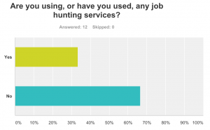
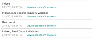
In order to make my website more appealing to my target audience, I needed to know what job hunting websites, if any, that they were using. Thanks to the results from my survey I knew which websites my demographic found the most appealing and we’re using more frequently. These were revealed to be Indeed and Reed, so I checked them out.

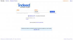
Upon entering the website you are greeted with two text boxes, asking for “what” kind of work you’d like to do, and “where” you would be willing to do it. While I think this may be a little intimidating, being the first thing that you see, I may want to consider adding something like this to my service. Users will more than likely wish to include preferred fields of work, and where they are located so they are not offered something too far away from them. Colour wise, the main theme for this website seems to be blue and orange. These colour contrast one another so they work well together, but I don’t think they work very well together in this instance. It feels like there is a main theme with the blue all over the page, with just a few light splashes of orange here and there. I am considering using blue as a primary colour in my design, but I think I may contrast it with a different shade of blue. I think this will also fit the theme of my idea too, what with the idea of dream jobs and “blue-sky thinking”.
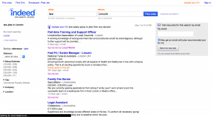
To find out a little more I entered a keyword into the “what” box and search for some results. I went with “Law” because I thought it would return a good number of results.

Here I was presented with a list of offers relating to the “what” and “where” I previously gave. The listings are organised neatly, each option is clearly separated from the rest. On the side you can refine your search by increasing or decreasing the distance away from you, and the average salary. All these aspects are important to consider so it is good to be able to search with them in mind. Looking at the colour scheme again I still don’t think the clashing colour works, especially now that they’ve thrown pink into the mix. Personally I think this would look a lot cleaner just using different shades of blue, and that’s what I’ll be doing.
The other website that was popular on my survey was Reed.

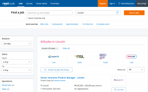
Visually, Reed does a lot of things similar to Indeed. They both use a blue and orange colour scheme with some splashes of pink here and there. I don’t know what is so appealing about the combination of these colours, but whatever it is I don’t really understand it. However I do think it works a little better here,with orange being used for buttons rather than text links. Still not sure about the use of pink though. Also, I think they way in which you can refine your search is much better on Reed. You can still refine by adjusting the distance from you and salary, and you can also specify the field of work, type of job (contract, temporary etc.), who the job ad was posted by and when it was posted. This wide range of options can really help users pin down a job posting ideal for them.
While I won’t be using a lot of the job hunting features, checking out Reed and Indeed has given me some ideas of how to lay out my website.
